Sters
Designing a brand that moves with intention, not noise.
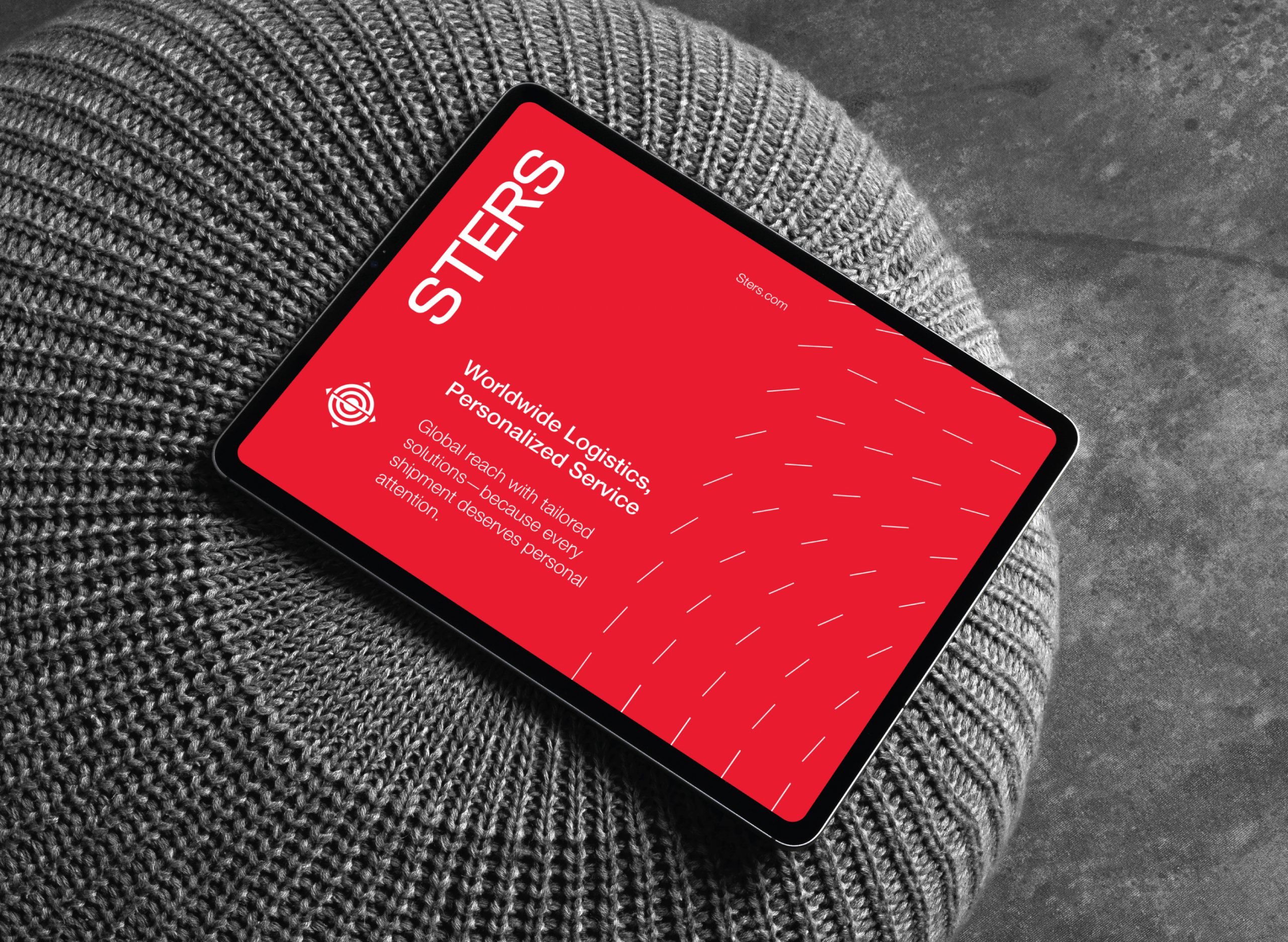
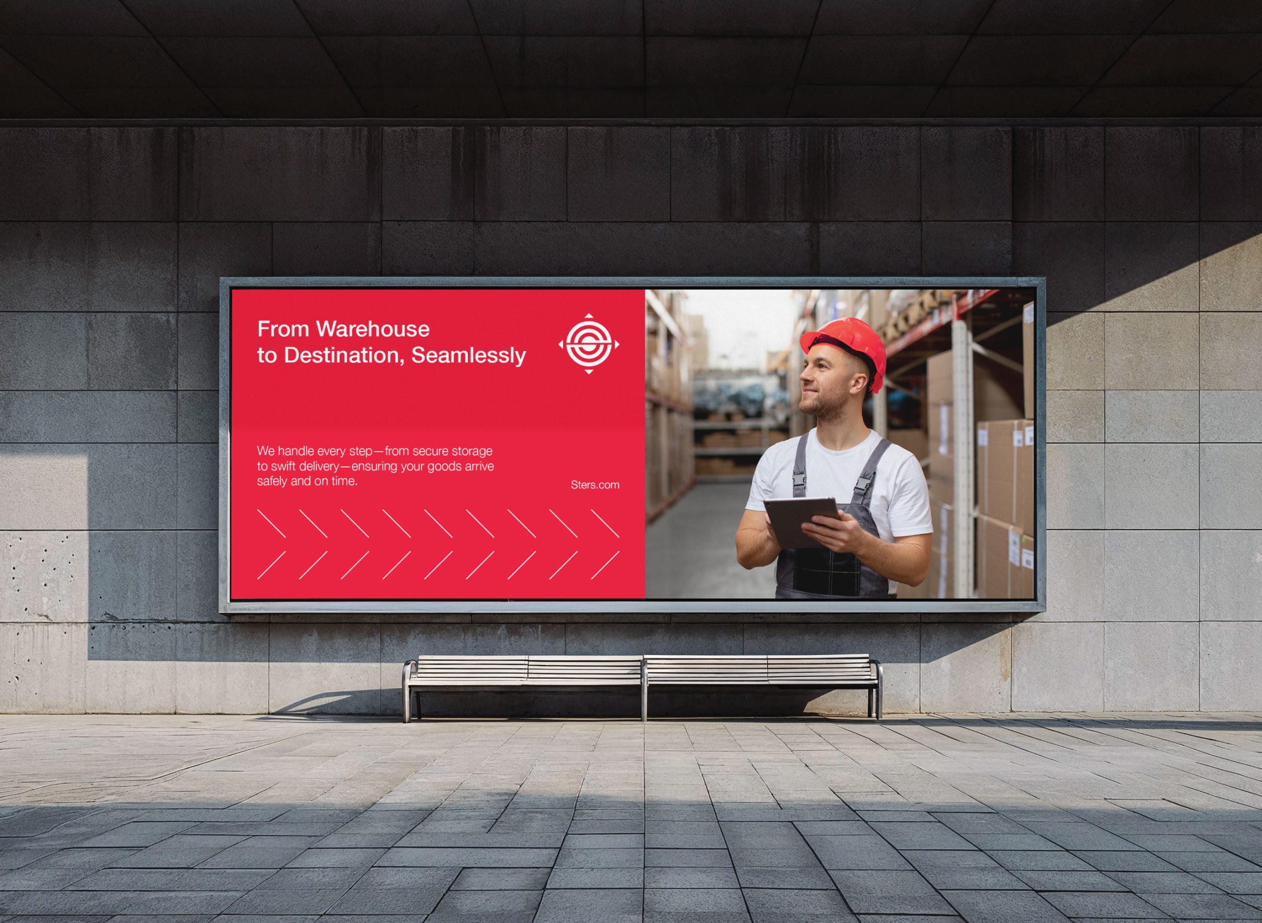
Sters is a global logistics company that handles importing and exporting with efficiency, precision, and care. With a worldwide reach and a mission rooted in reliability, they approached us with a clear ask: create a brand identity that feels as seamless and trusted as the shipments they move across borders.
This wasn’t just about looking corporate or international—it was about embodying the rhythm and rigor of global logistics. Sters needed a visual language that could carry across shipping documents, freight hubs, and everything in between—while reflecting their core values: clarity, movement, and trust.
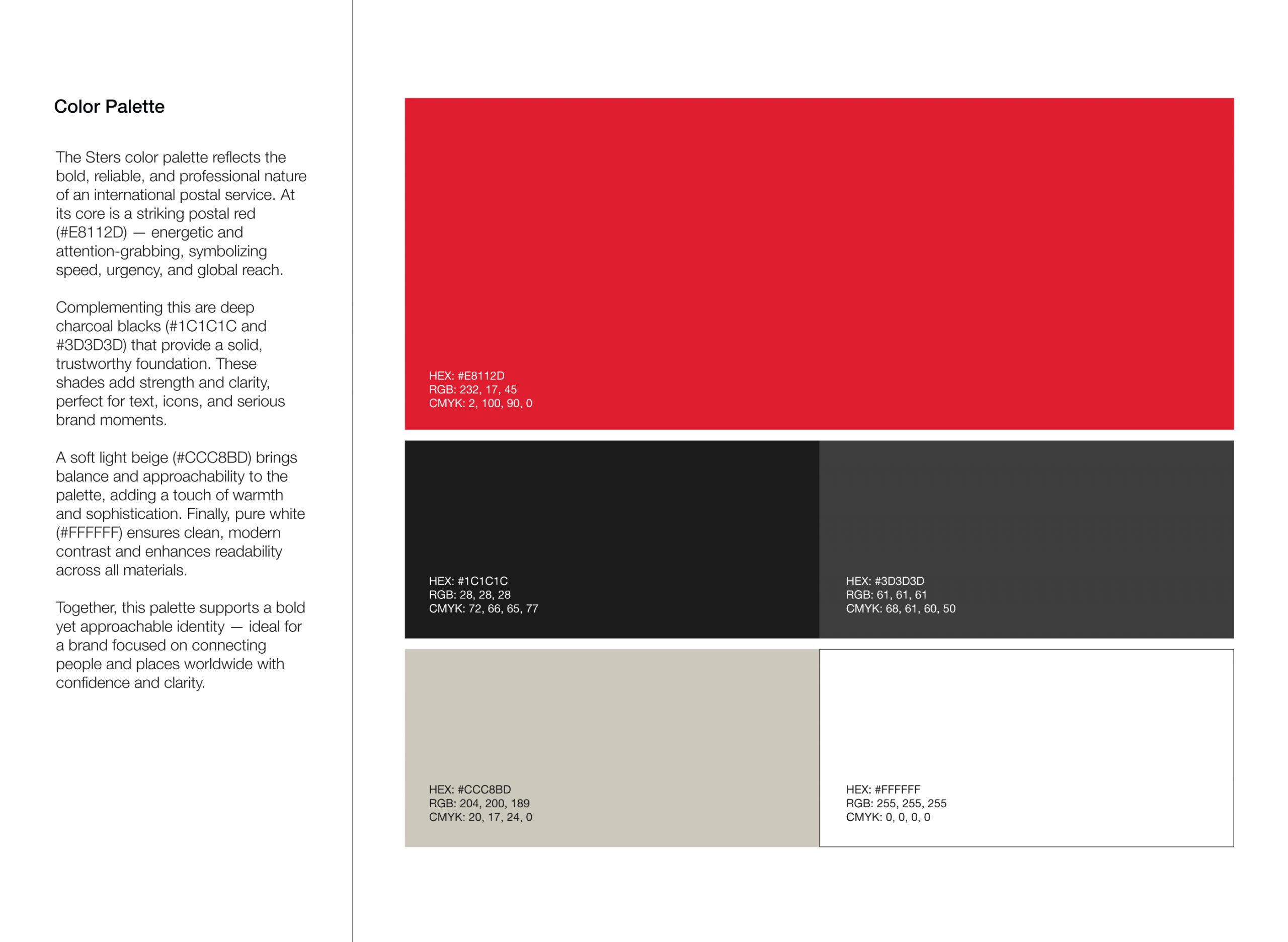
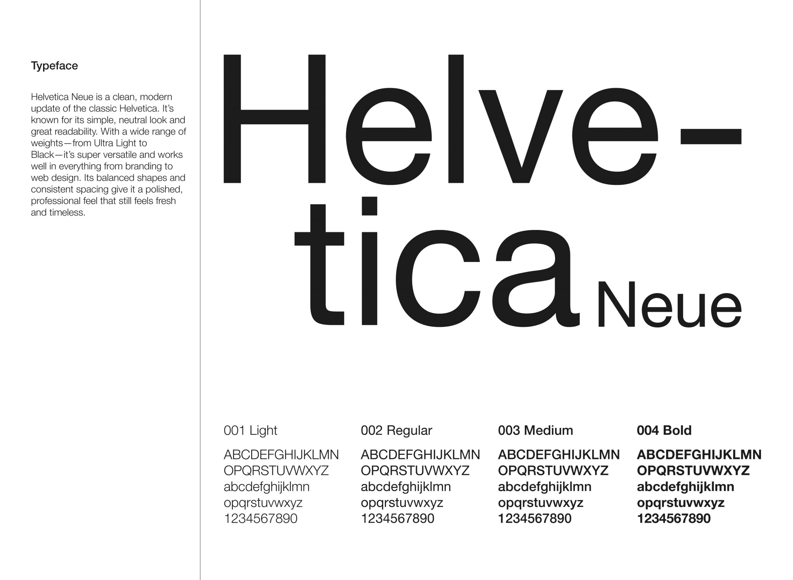
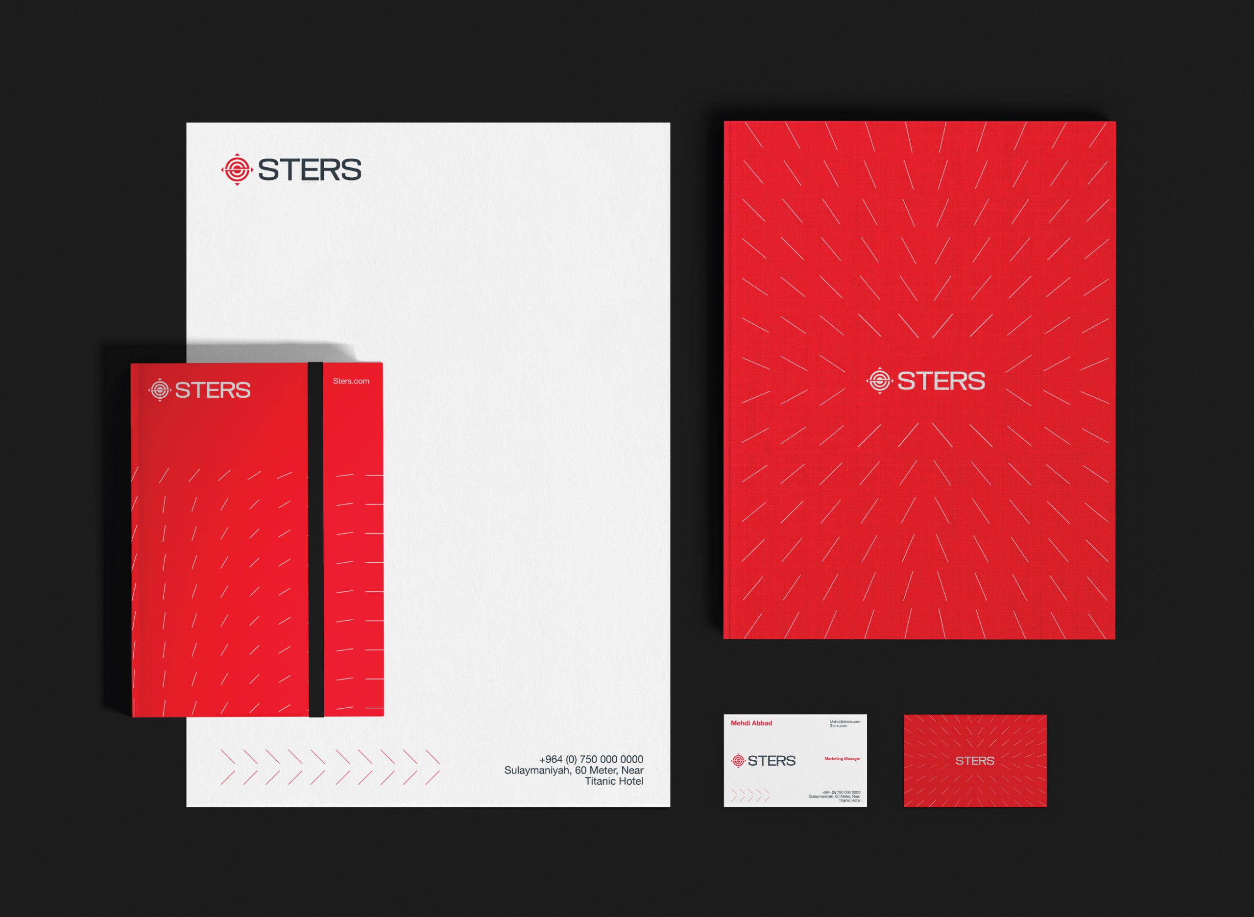
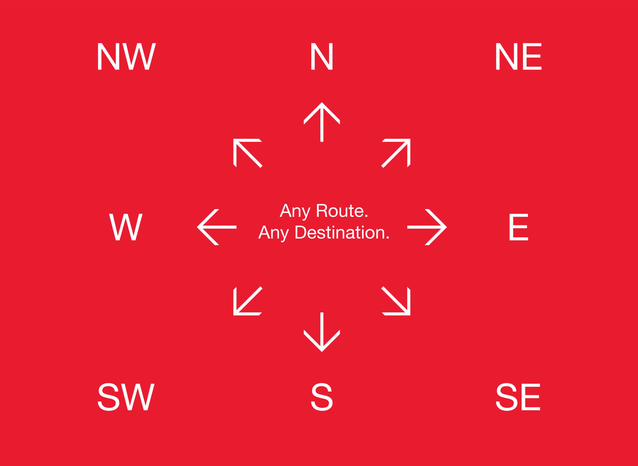
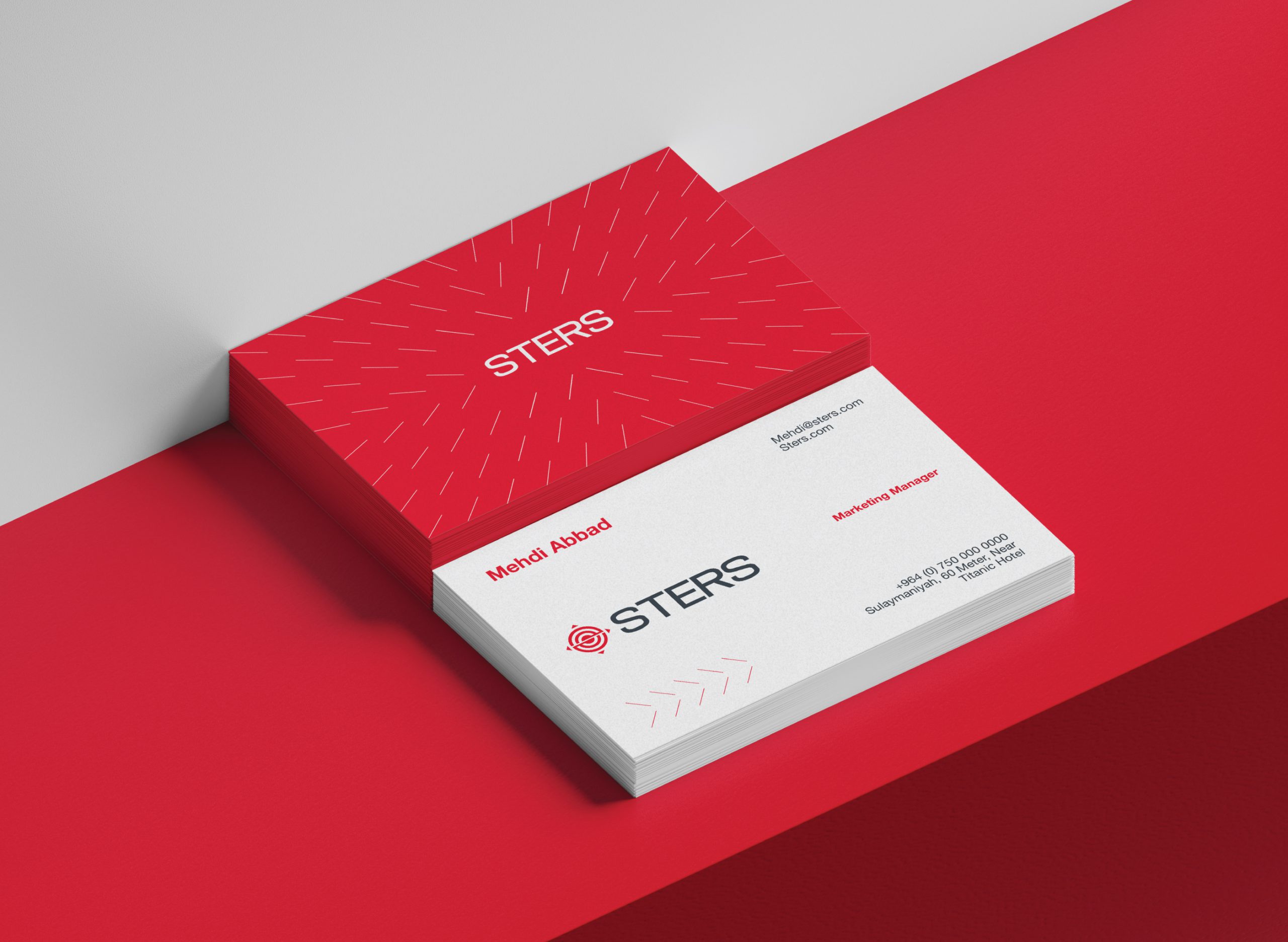
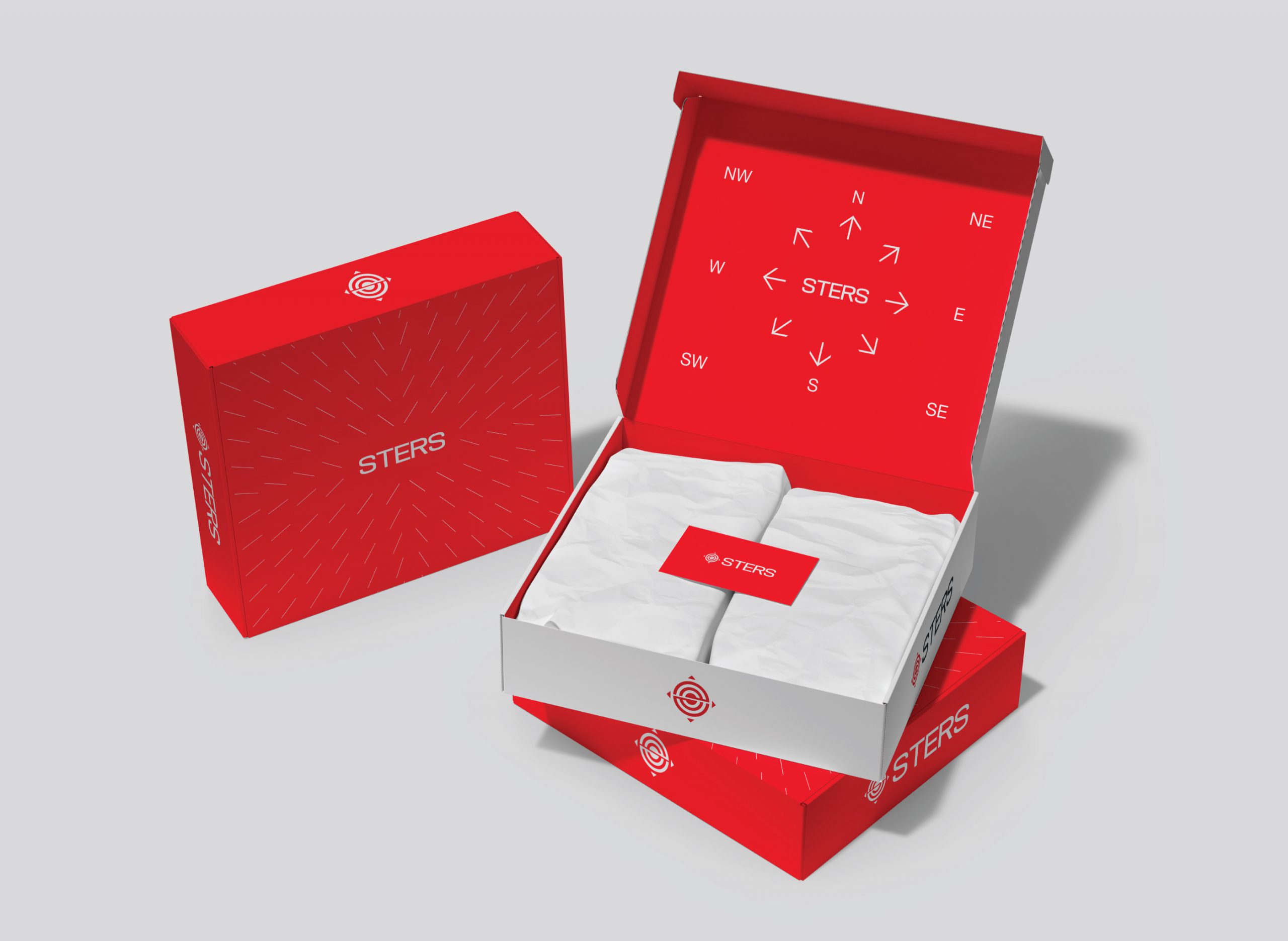
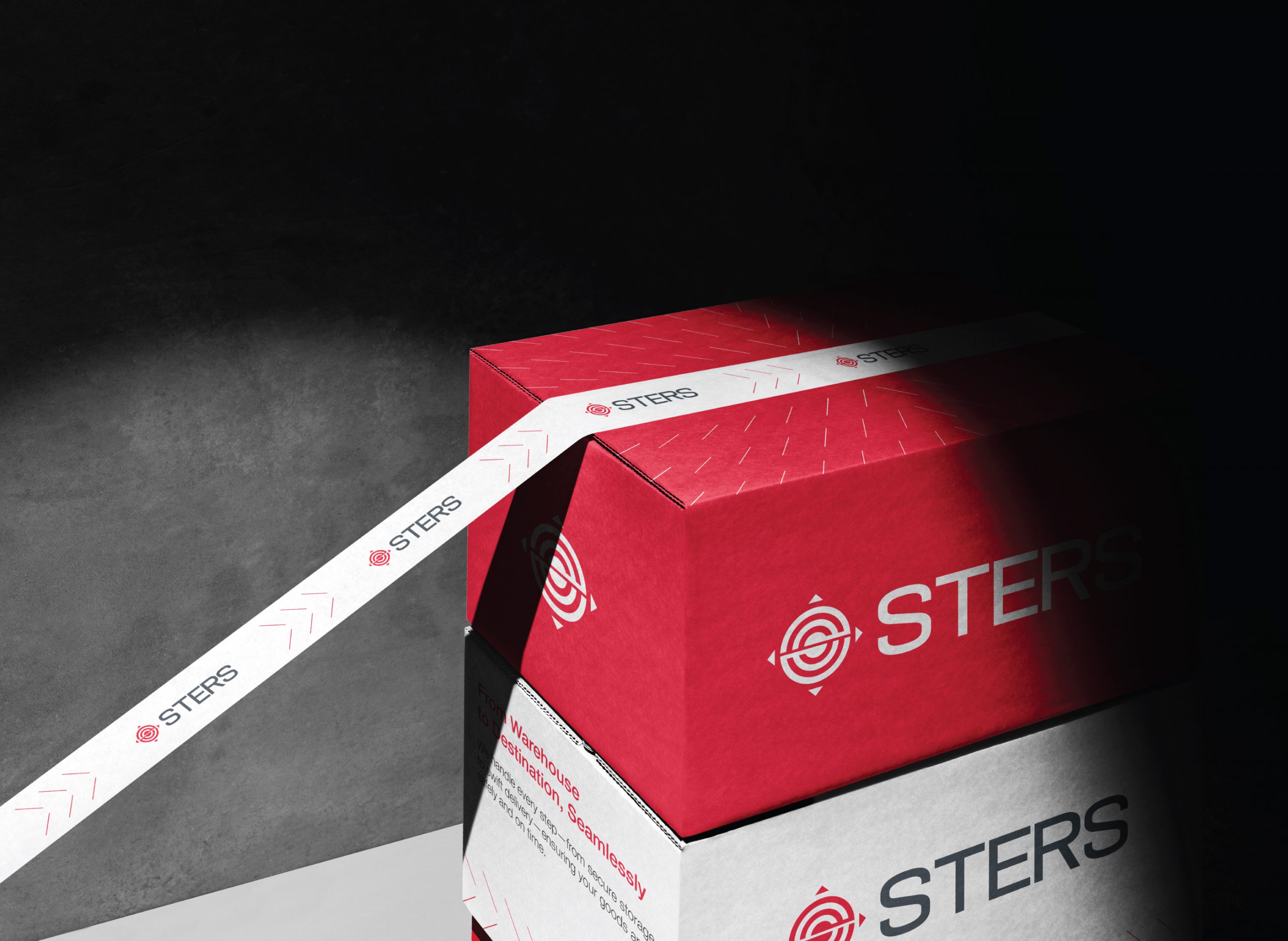
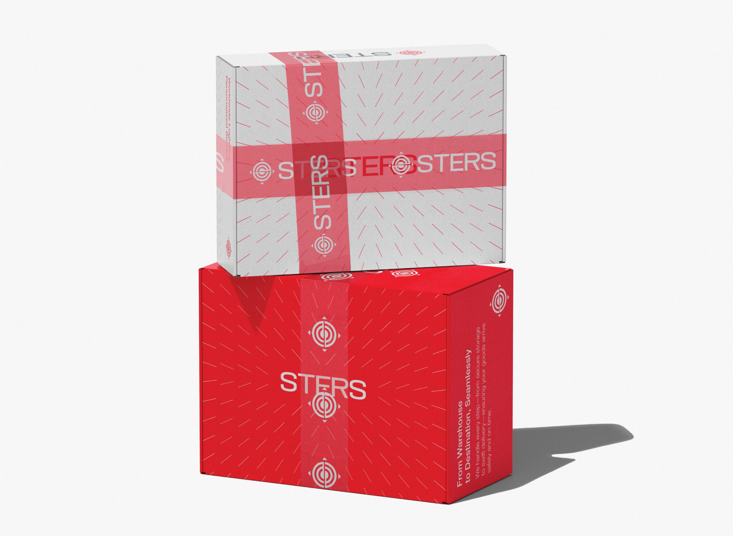
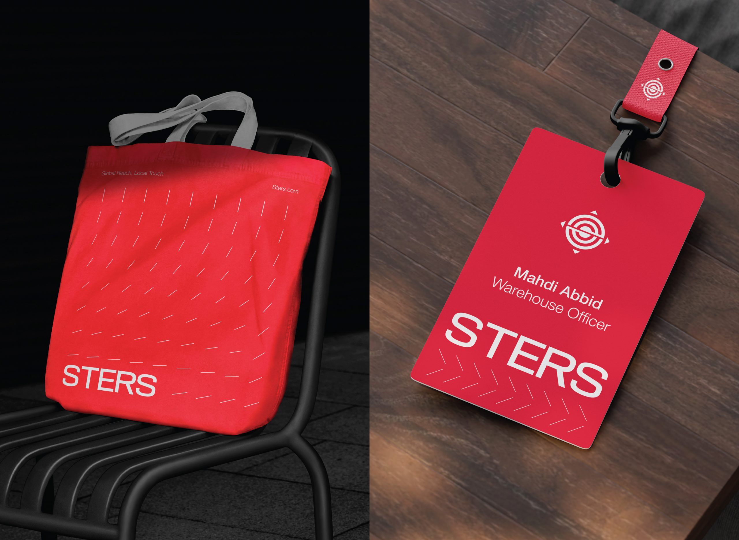
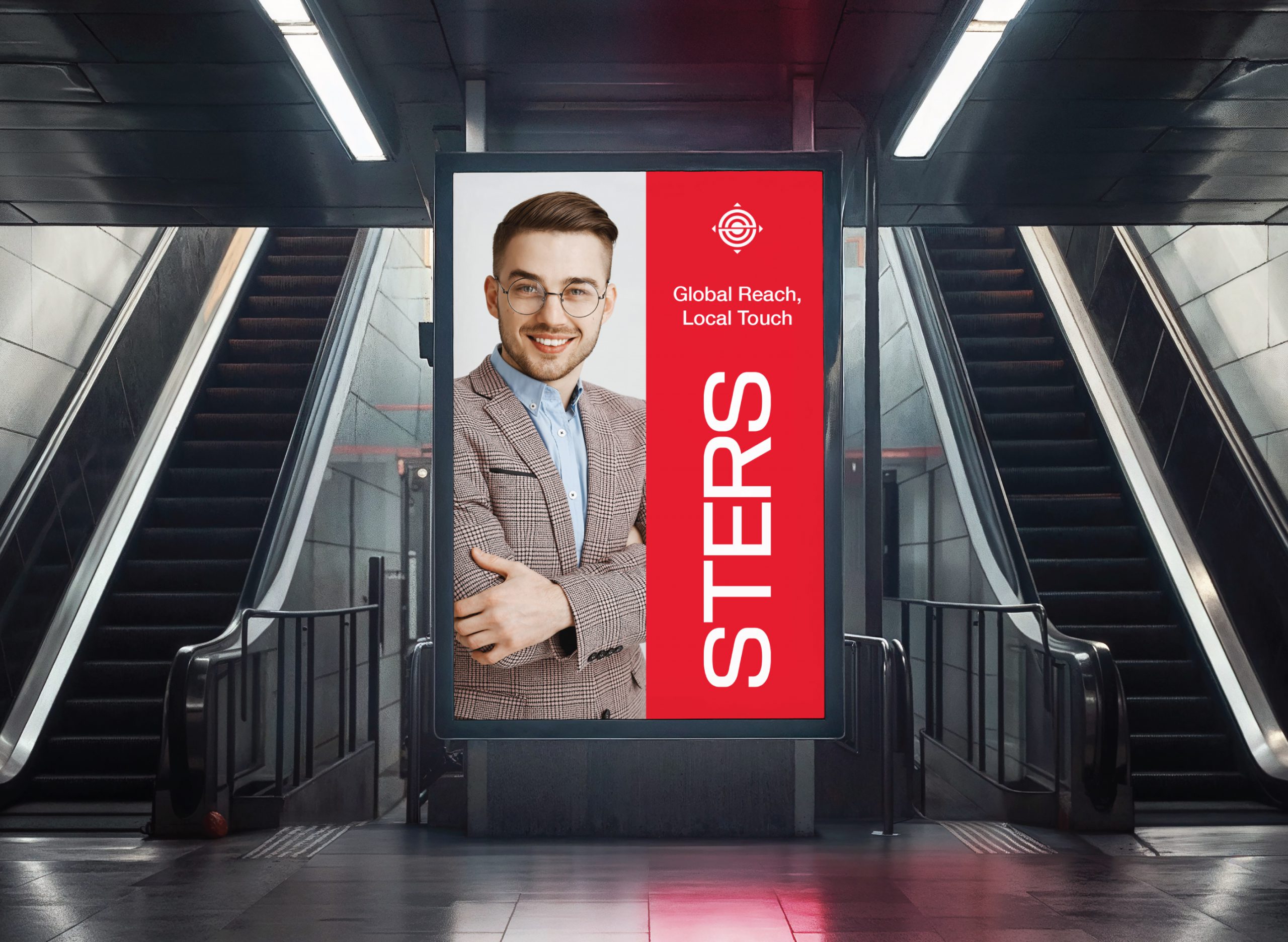
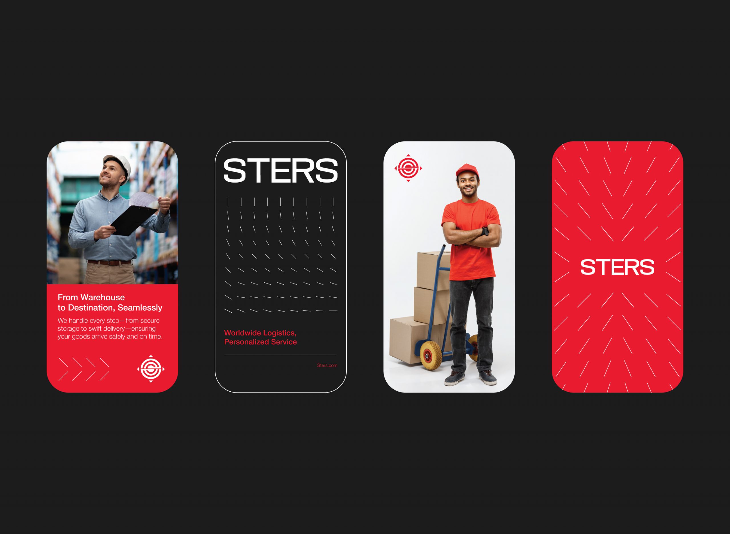
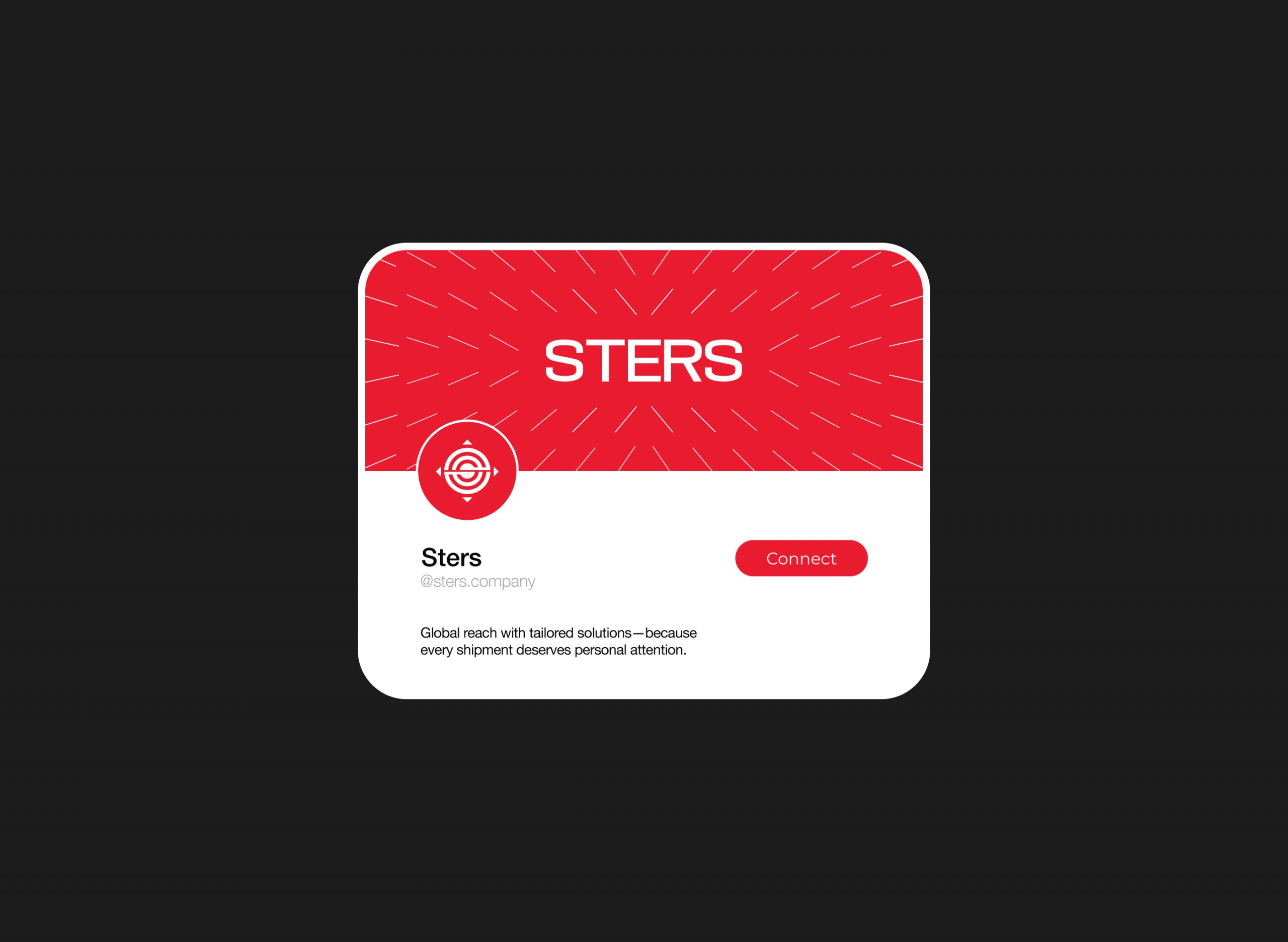
We built a brand system from the ground up, starting with strategy. Every design choice was informed by the journey of a package—structured, secure, and purposeful. From the directional iconography that suggests movement, to the bold yet refined typography and globally resonant color palette, the identity is both dynamic and dependable.
What we crafted is a brand that travels well—confident, efficient, and unmistakably Sters. It doesn’t shout to get attention; it arrives, delivers, and keeps moving—just like the company it represents.
Scope of Work:
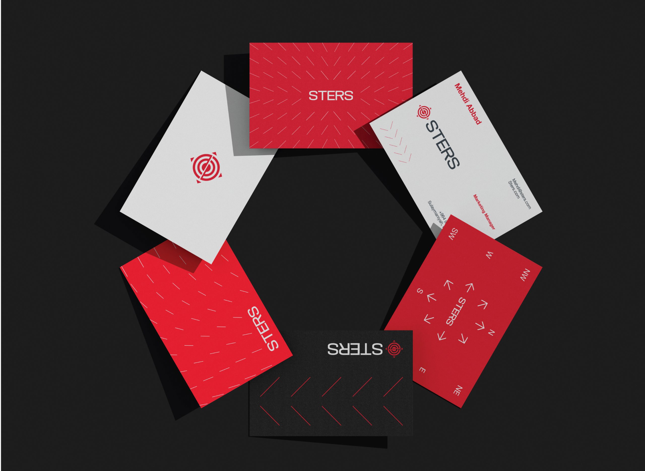
→ Logo & Visual Identity
→ Typography & Color System
→ Brand Guidelines
→ Stationery & Collateral Design
→ Environmental Signage